Project
Analysis with QGIS and Python
Heatmap Generation
Welcome to Module One of this project!
This guide will walk you through setting up your environment, creating heatmaps with QGIS and Python, and visualizing data from our sorghum research field trials. These instructions are designed to be accessible for high school students and will help you explore geospatial data and its applications.
Why Heatmaps are Important
Before we start, let us understand why we are creating a heatmap in this activity. Heatmaps turn data into visual insights! A heatmap is a useful way to visualize the location and intensity (or density) of data points. Our heatmap uses a gradient of colors, ranging from low (Green) to high, (Red) which represents a normalized extent of values tied to the individual data points. In our case, the locations and value of the data points are derived from the location and output readings of the installed soil sensors. A very specific example to get the point across would be the following:
Example:
You have moisture data from a field, collected from sensors scattered across the field. You are asked to map this moisture data, so the farmer knows where the most wet portions of his field are. After collecting your moisture data, analyzing it, and generating a heatmap, you see there is a large red section in the middle of your generated heatmap. You now would be able use your findings to show your farmer that he has a portion of his field that collects more water than the other parts of his field. You would now tell him to not plant a crop there that does not do well in standing water.
Pretty cool huh! Lets move on to setting up the activity.
Setting Up Your Project
Download Project Files
- Before you begin, download the project files located here: Project Files.
- Create a folder in a location you’ll remember and place all downloaded files, including the Shapefile folder (
plot_boundariesfiles), in it.
Tip for Instructors!
The instructor(s) of the course, can downloaded the needed files for this activity here if they wish to provide the students the needed code files beforehand.
Install Required Software
Install QGIS
Tip for Instructors!
It is recommended that the instructor(s) of the course, downloads QGIS beforehand, to ensure that all students have adequate access to QGIS, and the same version of the software. If you are not able to, the following instructions can guide the students on the best practice for installation.
- Visit the QGIS Download Page (if you have not done already).
- Choose the Long Term Release (3.34 LTR) version.
- Select your operating system (Windows, macOS, or Linux) and follow the installation instructions.
- When QGIS is installed, be sure to have the program running before you continue in the Heatmap Creation section.
Making the Heatmap
Heatmap creation
Generate and View Heatmap Using QGIS
If it is not already, make sure that your QGIS software that you downloaded previously, is open and running!
Select
Pluginsfrom the toolbar, and choosePython Consolefrom the dropdown menu.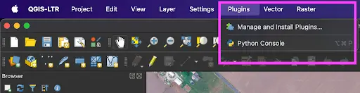
Within the Python Console, choose
Show Editor.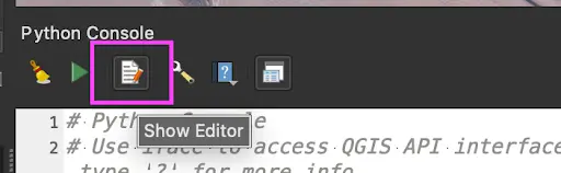
Within the newly opened Python Editor, choose
Open Script...and select theare_pyqgis.pyscript from the Project Files downloaded.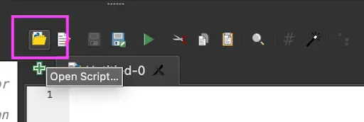
You should know!
Remember, the needed files were downloaded from the google drive folder previously provided to you here: Project Files. You are looking for the Section1: QGIS_and_Python folder, where the needed files are located.
With the script opened, provide for string constants CSV_IN, SHP_IN, and PROJECT_OUT at lines 23, 24, and 25. Each will have examples below them of how the path would look on either a Windows or Mac(Apple) computer.
CSV_IN: This is the path to thefield_sensor_data.csvfile.- Windows:
C:\Users\<Your*Username>\Downloads\Section1* QGIS*and_Python/field_sensor_data.csv- Mac:
/Users/<Your_Username>/Downloads/Section1\* QGIS_and_Python/field_sensor_data.csvSHP_IN: Path to theplot_boundaries.shpfile. Ensure this file is in the same folder as the otherplot_boundariesfiles (this is very important!).- Windows:
C:\Users\<Your_Username>\Downloads\Section1_ QGIS_and_Python/Shapefile/plot_boundaries.shp- Mac:
/Users/<Your_Username>/Downloads/Section1_ QGIS_and_Python/Shapefile/plot_boundaries.shpPROJECT_OUT: Output the path and filename for the generated QGIS project file (e.g.,/path/to/your/qgis_heatmap.qgs), making sure to include the.qgsextension on the filename.- Windows:
C:\Users\<Your_Username>\path\to\output\qgis_heatmap.qgs- Mac:
/Users/<Your_Username>/path/to/output/qgis_heatmap.qgs
Important!
You can right-click a file in the Explorer tab and choose
Copy Pathto get its file path, to use in the above step. Paste this into the quotes for each.Example:
CSV_IN = r"<paste_path_here>"If your file path is
C:\Code\field_sensor_data.csvthen your assignment will look like:CSV_IN = r"C:\Code\field_sensor_data.csv"Provide
date_startanddate_endfor the date range you wish to view ( see the commented section beginning at line 27 ). A date range you may wish to work with could be:2024-06-14 to 2024-12-28.- OPTIONALLY: Instead of a range, provide a list of dates at line 36 variable 'dates'.
Example:
dates = ["2023-08-03", "2023-08-05", "2023-08-07"]Provide the column name for the
label_namevariable for the data you wish to view as a heatmap at line 39. This refers to the column/header names within thefield_sensor_data.csvfile.
You should know!
For the label_name, you can find these in the .csv file mentioned previously. Please see below for all of the labels that can be used. Only one can be used at a time though!
The full list of sensor data label_names compatible with creating a heatmap:
- Battery Voltage (mV)
- Solar Voltage (mV)
- USB Voltage (mV)
- Atmospheric Pressure (kPa)
- Air Temperature (°C)
- Gas Resistance (kΩ)
- Relative Humidity (%)
- Illuminance (lux)
- Soil Moisture 1 (VWC)
- Soil Moisture 2 (VWC)
- Calibrated Counts VWC 1
- Calibrated Counts VWC 2
- Electrical Conductivity 1 (mS/cm)
- Electrical Conductivity 2 (mS/cm)
- Soil Temperature 1 (°C)
- Soil Temperature 2 (°C)
- Soil Temperature 1 (F)
- Soil Temperature 2 (F)
Important!
Please remember toenclose the trait you select in quotes (""):
Good: “Soil Moisture 1 (VWC)”
Not Correct: Soil Moisture 1 (VMC)
Click the
Run Scriptat the top of the Python Editor to execute the script!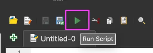
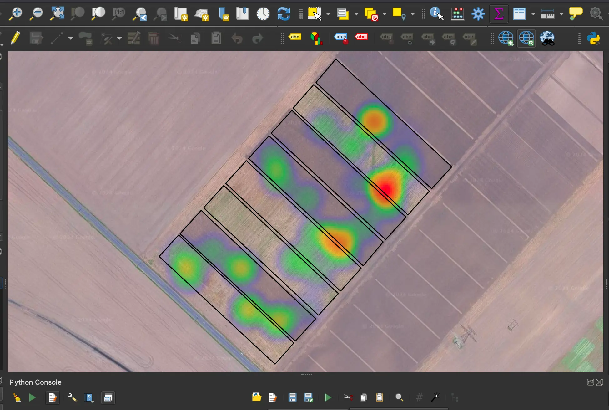
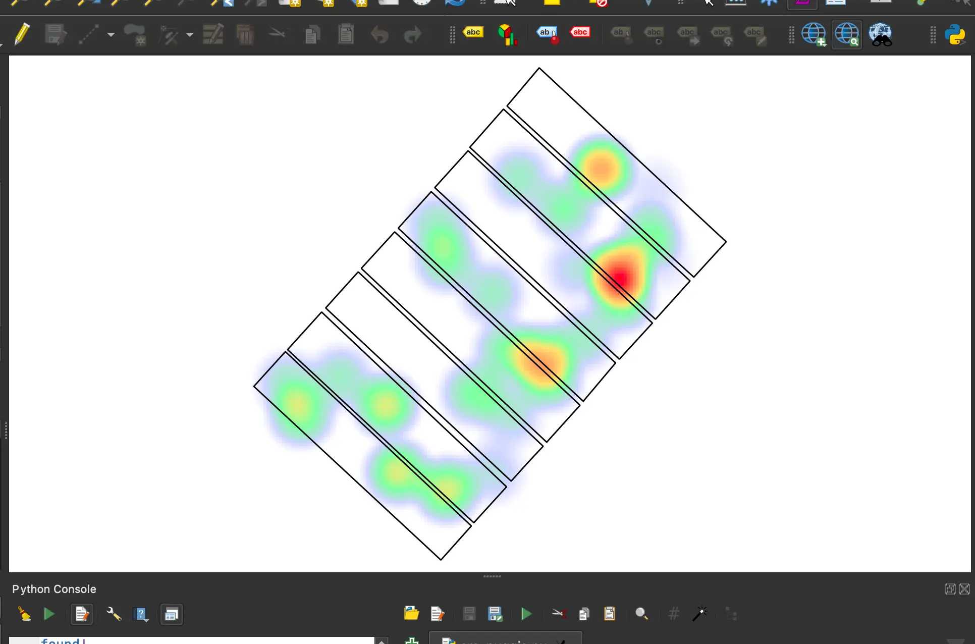
Awesome! If you have made it this far, you should now see the heatmap and plot outline appear in the QGIS view. The following is what a successful heatmap generation should look like:
Troubleshooting tips
If any files are
not found, check your paths and try again. Use absolute paths if necessary.If the software crashes, you may need to start from the beginning as sometimes progress does not save.
You should know!
It is common for software applications (like the one you are using) to sometimes crash. No need to panic!
Satellite Layer
Add Google Satellite Layer
Add the Google Satellite layer by right-clicking
XYZ Tileslocated in the browser at left, and chooseNew Connection....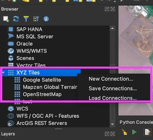
Enter the following details:
- Name: Google Satellite
- URL:
http://mt0.google.com/vt/lyrs=s&hl=en&x={x}&y={y}&z={z} - Click OK.
Under XYZ Tiles, find your newly created Google Satellite entry and drag-drop it into your
Layerslist. Rearrange the layers so that the Google Satellite layer is at the very bottom.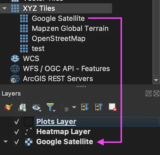
You should now see your heatmap rendered with real imagery from the satellite view. Great job!
You should know!
If the heatmap is not visible, right-click the Heatmap Layer and select _Zoom to Layer(s)_. 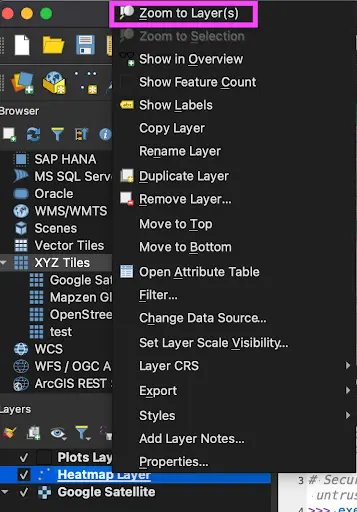
And that is it! Congrats on successfully creating your first map using real data from our field trials, to visual it using heatmaps and QGIS!
So you have generated your heatmap, now what? You are probably thinking:
why was this important and how do I understand what the heatmap is telling me?
Lets find out...
Analyzing the heatmap
In QGIS, a "layer" represents data that you include in your QGIS Project. The data can take various forms, such as:
- Raster (image)
- Vector (points, lines, shapes)
- Mesh (a grid of data points) layers
In this case, the Google Satellite Layer is a tiled Raster layer which pulls its image data from Google satellite photos. The order of the layers determines the order that items are visually rendered to the screen, one on top of the other. You can think of the list of layers like a stack, where the layer at the bottom is placed first, and the layer at top is placed last.
Saving Your Heatmap
This next set of instructions is technically optional for the time being, if you wanted to move on. You will eventually have to do this step in Module Three though, so we figured we may as well include the needed steps while you still have your QGIS program open!
You have created the heatmap, now we need to save it as a PNG file for later use. Let us walk through how to do this.
Collecting & Exporting the Heatmap from QGIS
Follow these steps in your already openned QGIS program to export your heatmap as a PNG image file:
Have open your QGIS Project
- If you had previously closed your instructions, please run through the Module One content again and complete your heatmap generation.
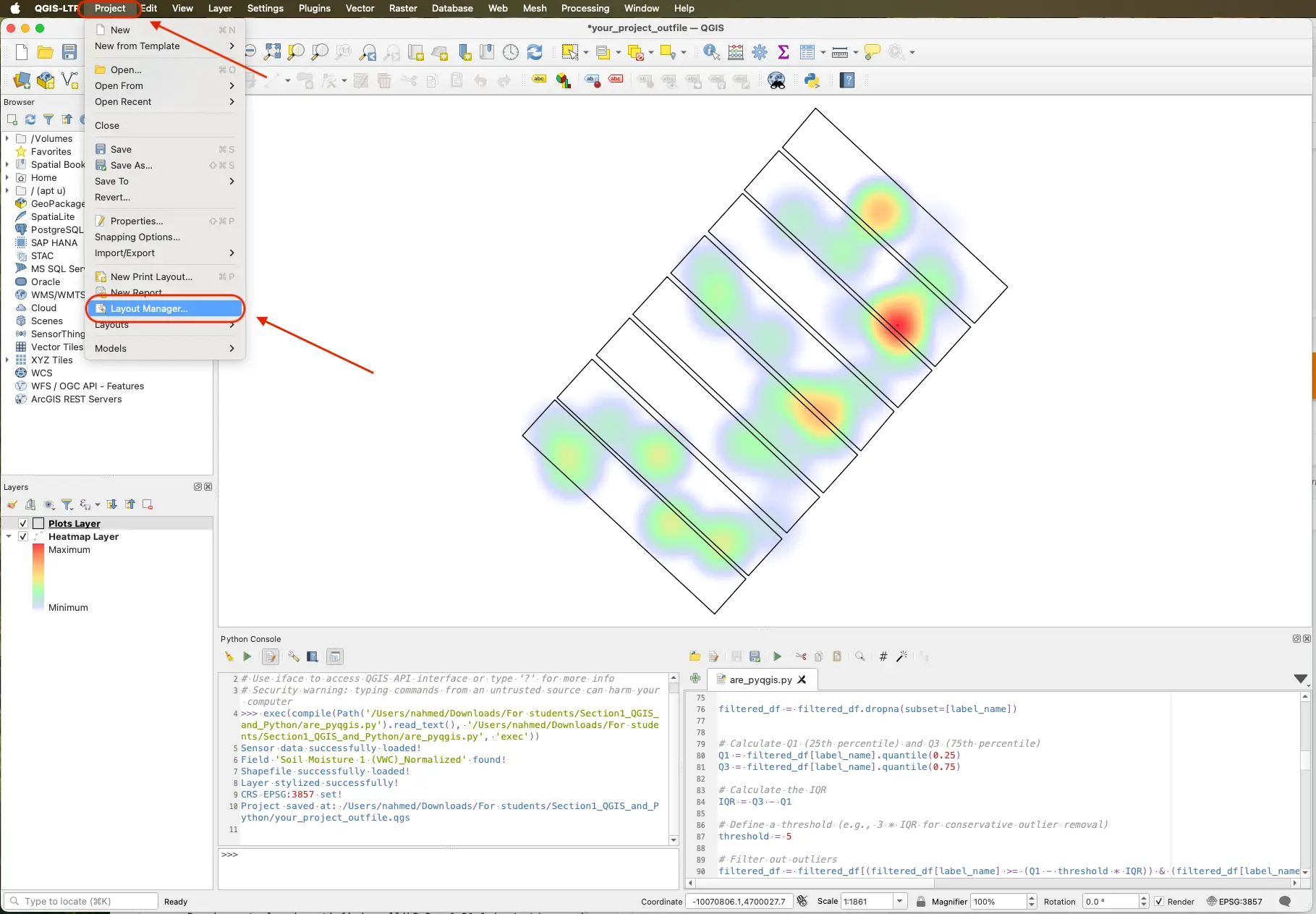
Select Layout Manager
- Go to
Projectthen selectLayout Manager…
- Go to
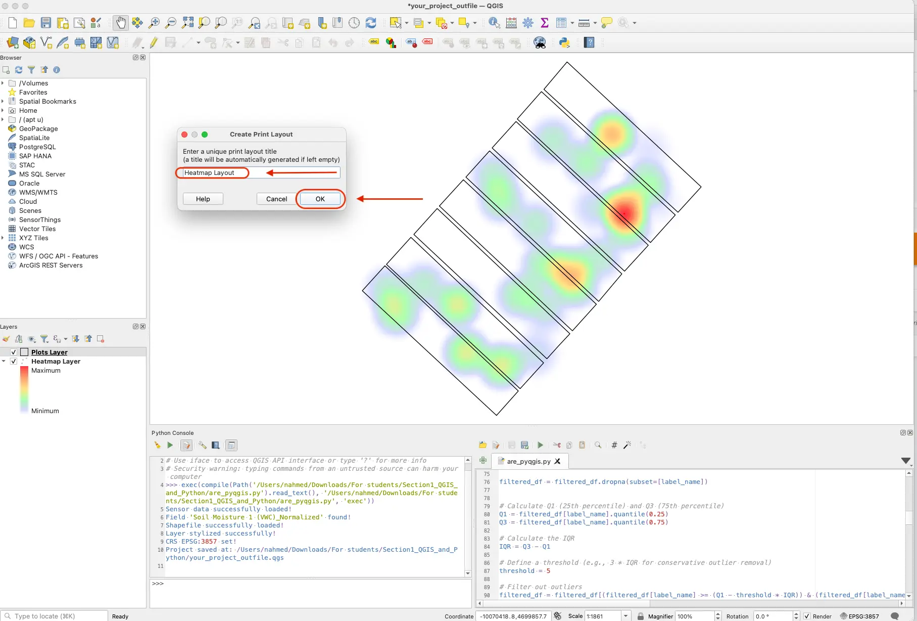
- Create a New Layout
- Name it “Heatmap Layout”, and click
OK.
- Name it “Heatmap Layout”, and click
- Add Map to Layout
- In the Layout toolbar, click the
Add Maptool icon.
- In the Layout toolbar, click the
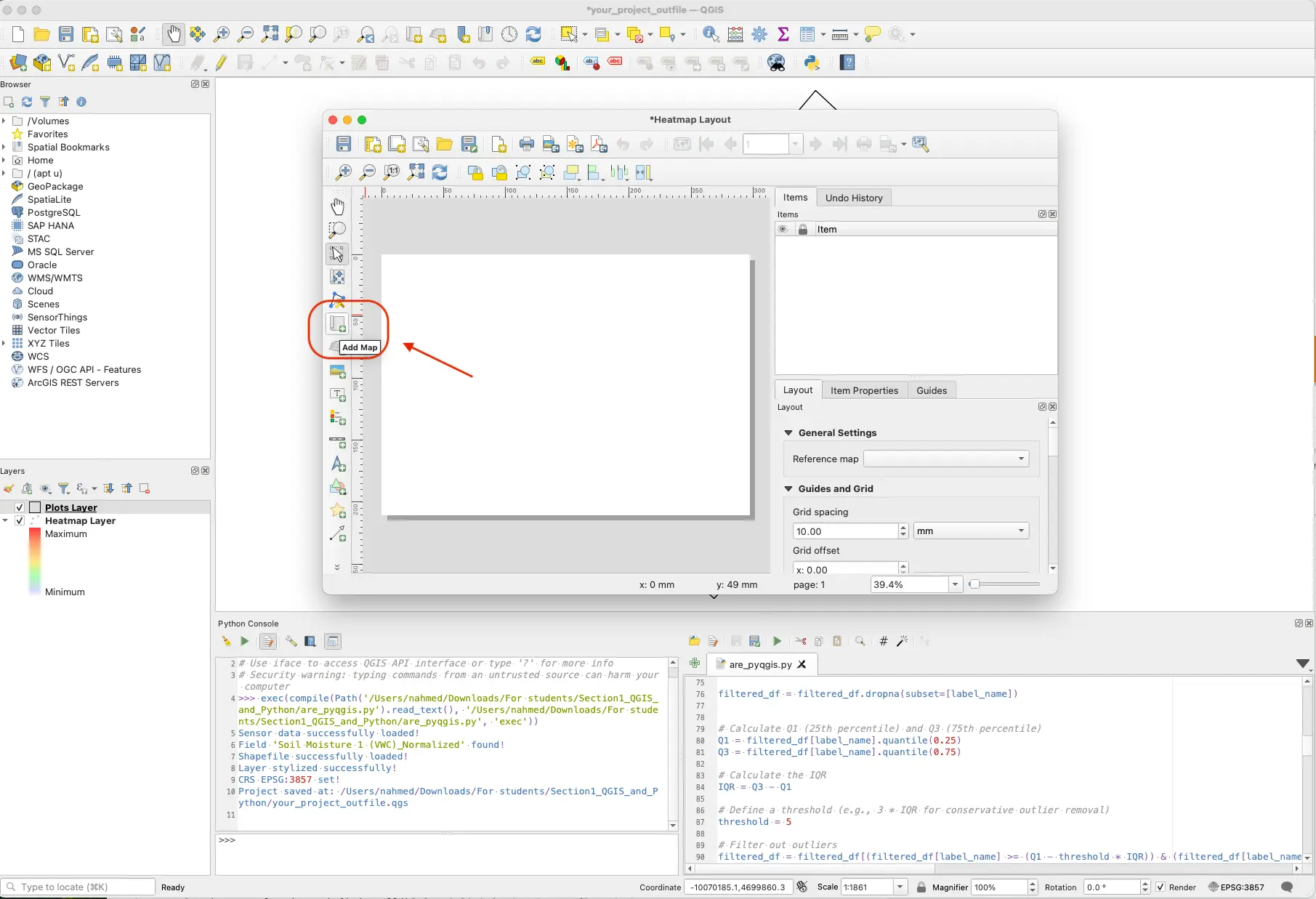
- Draw a rectangle
- Draw a rectangle on the canvas, your heatmap layer will appear inside.
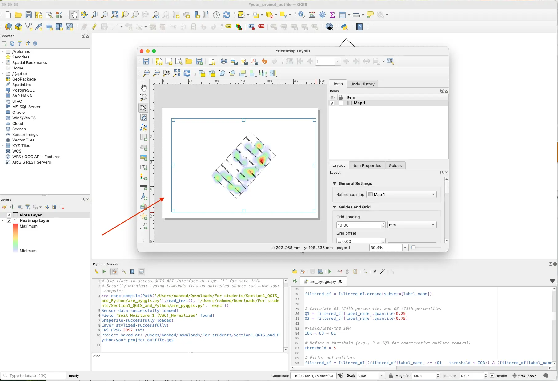
Export as Image
- Go to
Layoutthen selectExport as Image… - Choose PNG, give it a filename (e.g., Heatmap Layout.png), and click
Save.
- Go to
Verify the PNG
- Locate and open Heatmap Layout.png to ensure it exported correctly.
- Keep this PNG to be used later in Module Three.
SCREENSHOT
Important!
Please remember where you saved your Heatmap.png file! If you forget, or lose track of it, you will have to run all of Module One again to make another!
Learning Continued
How Heatmaps and Machine Learning Relates
In the next section, you will be moving on to Machine Learning. Don't let the word scare you! We will break it down more soon. You might be wondering..
How is the heatmap that we just created, important to the upcoming Machine Learning section?
The soil sensor heatmap is essential for both the analysis and interpretation of the Machine Learning (ML) models, as it visualizes spatial and temporal variability in key environmental variables, such as soil moisture, soil temperature, electrical conductivity, air temperature, humidity, pressure, and light, across the sorghum field. These sensor-derived factors significantly influence plant growth and trait expression, making them critical inputs for the ML models (e.g., PLS, XGB, etc.) used to predict sorghum traits. Incorporating this heatmap data enables the models to account for field-level heterogeneity and genotype-by-environment interactions, improving prediction accuracy and model robustness.
Furthermore, interpreting the heatmaps helps assess the degree of environmental variation across field plots, offering insights into how well the models generalize under diverse conditions. This is an important consideration for reliable future predictions!
Learning Resources
Want to learn more? Checkout the links below!
Check out this live example of drought throughout the United States being visualized using heatmaps: Drought Visualized
If you want to see other types of heatmaps that can be generated, visit this website here: A Complete Guide to Heatmaps
Please visit this source if you want to know more about interpreting heatmaps: How to Interpret a Heatmap
Glossary
Identified Keywords
- Heatmap
- QGIS
- Python
- Shapefile
- CSV
- Raster
- Vector
- Mesh
- Layer
- XYZ Tiles
- Satellite Layer
- Geospatial Data
- Gradient
- Data Points
- Absolute Path
Definitions
Heatmap: A two-dimensional data visualization in which individual values are represented as colors. In this context, it shows spatial intensity or density of sensor measurements over a mapped area.
QGIS: An open-source Geographic Information System application used to view, edit, and analyze geospatial data. It provides tools (e.g., Plugins, Python Console) to generate maps and perform spatial analyses.
Python: A high-level programming language used here to script QGIS operations (via the Python Console) and automate heatmap creation from field sensor data.
Shapefile: A popular vector data format for geographic information system (GIS) software. A “Shapefile folder” typically contains several related files (.shp, .shx, .dbf, etc.) that together define map features such as plot boundaries.
CSV: Short for “Comma-Separated Values,” a plain-text file format where each line is a record and each field is separated by a comma. In this guide,
field_sensor_data.csvholds tabular sensor readings and timestamps.Raster: A grid‐based data layer in which each cell (pixel) holds a value—often used for imagery (satellite photos) or heat intensity. QGIS treats satellite imagery as a tiled Raster layer.
Vector: A GIS data type that represents features as points, lines, or polygons. For example, the
plot_boundaries.shpshapefile is a Vector layer defining each plot’s polygon outline.Mesh: A grid of data points connected in rows and columns, used to represent six-degree-of-freedom surfaces or 3D models. QGIS supports Mesh layers for advanced visualization (though this guide focuses on Raster and Vector).
Layer: A single dataset in QGIS (e.g., a Raster layer, a Vector layer, or a Mesh layer). Layers are stacked in order of rendering—bottom layers draw first, top layers draw last.
XYZ Tiles: A mechanism for adding web-based tiled imagery in QGIS. Each tile is requested by X, Y, and Z (zoom) coordinates from a remote server (e.g., Google Satellite).
Satellite Layer: A Raster layer sourced from satellite imagery (e.g., Google Satellite). It provides a real-world background, over which the heatmap is rendered.
Geospatial Data: Any data that is associated with specific geographic coordinates. In this guide, sensor readings are georeferenced by latitude/longitude and then visualized on a map.
Gradient: A color ramp (from low to high values) used in a heatmap. Commonly, green indicates low intensity and red indicates high intensity, representing normalized sensor values.
Data Points: Individual sensor measurements (e.g., soil moisture at a particular location and time). When plotted, each data point contributes to the overall heatmap density.
Absolute Path: The full file path from the root of the filesystem (e.g.,
C:\Code\field_sensor_data.csvor/home/user/project/field_sensor_data.csv). Using absolute paths ensures QGIS can locate files unambiguously.